
Okay, so let’s talk a little bit more about book covers. Specifically, let’s talk about typography (we’ll cover background art on a different post.)
Now, if you’re not a graphic designer, you may think that you don’t need to know anything about typography. Even if you’re an writer, you may not think you need to know it, either because you’re hiring another person to do the work for you or because a publisher has someone in their employ who will design the book cover for you.
Please allow me to reassure you: you do need to know this stuff. Why? Because there’s some awful work being done out there, and some of it is being presented to authors who don’t know any better as ‘professional’ when it looks anything but. Some of this work is being done by publishers, so its a trap someone can fall into even if they don’t consider themselves to be an independent or hybrid author. Make no mistake: this is your brand, your marketing identity, your logo. It’s in your own best interest to make sure that it looks as good as it can within your means.
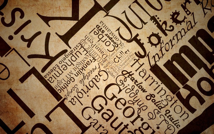
So let’s talk about type. First, there are a lot of type faces out there. Thousands and thousands of type faces of mind-numbing variety, which can be both intimidating and extremely frustrating if you’re searching for that one perfect style (or trying to remember where you saw that perfect font.) They also come with a variety of legal restrictions which can be a bit daunting (some fonts are only free for personal use, for example, and so can’t be legally used for a book that’s sold for profit, while others aren’t available for ebooks.) It’s important to check the limitations of a given font’s license.
This is probably why so many people just use the fonts that come stock on their computer, not realizing that these are indeed the fonts that everyone has stock on their computers. If people do brave the wild internet to find fonts, they discover that there’s some terrific stuff out there, and some stuff that could be used on maybe one project ever, and some stuff that had no business ever being used on the cover a book, ever, under any circumstances. Personally, I advise people to make peace with the fact that your favorite font is probably not going to be what looks best on a book cover, and that if you’re going to do it yourself, you’ll have to experiment a lot before you find the right fit. It’s a pain, but if good typography was easy…well, you know the rest.
First thing you will need a good font manager. If you don’t already have one, NexusFont is highly recommended for the PC (and free.) This will sidestep the tedious loading and unloading of fonts, which is a good thing, because you’re going to do it a lot.
So let’s go over the rules for book cover typography.
- First: it MUST be legible.
- Second: No really, make it readable or GTFO.
- Third: Have I impressed upon you how important legibility is yet? SO IMPORTANT.
- Four: Make it look good.
I tend to see the same mistakes being made in that regard, and they really aren’t that hard to avoid.

- Using novelty or calligraphy fonts. Bwhaat? But you have a fantasy book and you are absolutely in love with Ruritania which will be perfect on your cover…and… No. No it won’t. Tell yourself no. I understand it’s tough, but this is a tough industry. Be strong. Ruritania is a beautiful font. It’s also way too damn busy to be on a book cover, which is true of just about any calligraphy font or font with ‘chancery’ in the title. Go look at the fantasy books in your local bookstore. Go look at Game of Thrones. Notice how the font is just a normal serif save for a few little flourishes to personalize it? Remind yourself that before using Ruritania, Black Chancery or any font like it. If George R. R. Martin doesn’t need all the frills, neither do you.
- Forgetting that fonts are associated with genres. This isn’t a hard rule, but generally speaking, a serif font is probably going to show up on a fantasy or steampunk novel, a san-serif font on science-fiction (and often urban fantasy,) and script fonts on romances. Quirky fonts on young adult. Typewriter-style fonts are either on noir novels or sometimes horror stories. I don’t want to make too many generalizations, because there are plenty of exceptions, but it’s a good idea to understand that your font choice can have a large impact on what genre buyers think your book belongs.
- Putting bevel or embossed edges on type. For some reason I see this, again, on fantasy covers. Maybe people think it will make the font look like stone? But no, no it doesn’t. It doesn’t make it look professional either. It just makes the writing hard to read and reminds the reader that Photoshop exists.

- Using ANY photoshop filters. I’m not saying you can’t use them (heck, I use a drop shadow for the headline of Marduk’s Rebellion to make it pop a little more from the background, and I make no apologies for that) but be careful, because there be dragons. Again, look at what the big guys are putting out and realize that almost no one puts a lot of extraneous fluff on their type (except perhaps Baen, and while I understand the brand they’ve created, I don’t recommend you copy it.) Keep it simple, clean, and easy to read.
- Making the font the same contrast as the background. I would assume this would be obvious, but it isn’t…I see this all the time! Someone has a dark blue background on their cover and uses a similarly dark blue text on top it (maybe with a white glow behind it), or uses white text with a black drop shadow on a white background. I recently saw a cover where the author had created a brown stone texture for the book and then used a brown stone bevel for the book name. It was all but invisible when reduced to a thumbnail.
- Stretching type to fit the space. Okay, so just because you can adjust the horizontal and vertical size of a font does not mean you should. (Pro tip: you shouldn’t.) Fonts are designed to look best at a particular proportion and if you stretch a font to 150% height and 75% width it’s going to look stretched, awkward, and amateurish. You want the font to be larger? Make it larger by increasing the point size. You want it to be narrower or shorter? Find a different font. Yes, really, find a different font. No matter how much you love that font, if it’s not a narrow font and you need it to fit in a narrow space, it’s the wrong font. With how many free fonts are available these days, there is guaranteed to be something out there that fits your needs (no pun intended.) Oh and for goodness sake, no twisting, distorting or bending unless you actually DO want your cover to look like a circus poster. By the same token…
- Making fonts ‘bold’ or ‘italic.’ This takes a little explaining, so bear with me. There are two ways to make a font bold or italic in most programs. One is to hit the ‘bold’ or ‘italic’ icons on the top of the page, and the other is to actually go and select the bold or italic version of the font. In most programs, you’ll get two different results: the first way just takes the normal font and shoves it all into a slant or adds an outline around for boldness; the second method actually selects a specially designed version of the font that typically looks more polished and refined. If you make a font italic or bold using the first method, it typically looks quite bad. On that note, if you make something italic, please don’t have it be in all caps, especially if it’s your name or the book name. Leave the italics for accent text, if you must use it at all.
- Use more than 3 fonts. Honestly, more than 2 is probably too much, but sometimes it’s necessary. Point is, you want your cover to have a reasonably consistent look, and the fewer fonts you use, the easier that is to achieve. If your name is in one font, your title is in two different fonts, your subhead in a fourth font and you have a log-line in yet a fifth font? I guarantee you it’s too much.
- Use tired, dated fonts. There are certain fonts that many people consider cliche or dated. You might get away with some of these if you’re deliberately looking for a retro 80s feel, but its safer to avoid: Comic Sans, Times New Roman, Papyrus, Helvetica, Zaph Chancery, Zephyr, Bauhaus. One piece advice I’ve heard which is pretty solid is simply don’t use a font that came stock on your computer.
- Use a font created for an existing brand. Lots of times designers will actually create a custom font for a book, movie, TV series, and if that book becomes popular, some enthusiast will expand that into a whole, complete typeface on a lark. The problem with this is that the Harry Potter font is pretty much instantly recognizable as the Harry Potter font. Same goes for A Series of Unfortunate Events, Star Wars, Star Trek, Beautiful Creatures, etc. You want your own look, not someone else’s.

Okay, so that’s a lot of ‘don’t do this.’ What about do’s? What about fonts that will, generally speaking, work?
Over at the Book Designer they recommend Trajan, League Gothic, ChunkFive, Franchise and Baskerville, and honestly, I’ve got no gripes with that. Those are all solid, fine choices for fonts (and all available for free from fontsquirrel.com) So let’s expand out a little…I’m not going to recommend anything that isn’t free, and isn’t available for commercial use. Because nothing sucks more than falling in love with a font you can’t use or afford.
- Prime. This is a good font with a high-tech sci-fi feel that will pretty much instantly communicate that your book is science-like things.
- Alex Brush. Used correctly, this is a fantastic font for a romance cover. Used incorrectly, it will make me weep. (Hint: use it for a short title, and don’t use it for your name.) Allura and Aquafina are also solid choice for script fonts used to good effect as accents.
- Calluna. Related to Museo Slab (which is itself a very nice font) Calluna works very well for Fantasy books or any book where a good Serif font would be ideal.
- Droid. I used this font for Marduk’s Rebellion. It’s not for everything, but it has a clean, condensed, modern look that fit the project very well.
- GriffosFont. This feels a bit Victorian to me, just a touch old-fashioned, so it would be terrific for fantasy or steampunk novels.
- Heavyweight. Just a tiny bit grungy, but not so bad that it hampers readability. Solid font for Urban fantasy.
- Nexa. A very nice sans-serif. Not all of the fonts are free, but Bold and Light are, which is enough to make yourself something pretty.
- Quatrocentro. A nice alternative to Trajan
There’s plenty more out there, and pretty much no good way to find them except to fire up your search engine and go looking. Because I don’t do graphic design for a living anymore I usually have to spend a few days exploring fonts to find the right one. I think it’s worth doing.
Okay, next time, we’ll talk about background images, and why they are so extremely tricky.

Pingback: Book Covers: Backgrounds | Jenn Lyons
Pingback: Book Covers: Project Example | Jenn Lyons