

Okay, so in part 3 of this series, we’re now going to take what we’ve learned and apply it a real life example. Okay, a fictional example. A fictional example of fiction I totally made up. Even though I do in fact have a book cover on my to-do list right now (for The Culling Fields, the book I finished as part of NaNoWriMo 2013) I’m going to do evil, naughty things to the first example of such, and I don’t like the idea of doing it for a book that will actually see publication. Potentially awkward. Thus, let’s go with something invented for that purpose.
“A Litany of Ashes” is a post-apocalyptic YA about a teenage girl in a small community that survives by its religious rituals, designed to keep at bay the demons of radiation and nuclear fallout. But when she begins to think the demons are literal, is she going insane or has a terrifying new threat arisen in the post-nuclear landscape? So it’s a bit A Canticle for Leibowitz meets Handmaid’s Tale, basically. With demons. We’ll give it four type components: the title, the author name, a log line and a series mention.
- Title: A Litany of Ashes
- Author Name: Jenn Lyons
- Log line: There is no evil greater than what we make ourselves.
- Series mention: Book one of the Demon Core Trinity. (haha, Trinity — see what I did there? Ahem. I’m SO sorry. Okay, let’s continue.)
So with this knowledge in hand, I fire up google images and search for ‘nuclear holocaust.’ The first image I find is this: 
Now I strike it a bit lucky here: this is a public-domain image taken by the US government, so I can use it legally. It’s too small, but I’m so excited I barely notice! But what about the girl? I want a girl, right? Maybe I find a friend willing to let me take their picture. Maybe I actually go buy one. Here’s an image from Getty Images (note that this is just the preview image: I didn’t buy rights for this example.)

Okay, so let’s put this together? Ready? Ta-da!
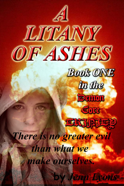
This hurt to create. Truly. Photoshop was so ashamed it crashed in the middle. And I probably didn’t use enough font variety to reach true authenticity, but we’ll go with what we have.
- Bold italics all caps Times New Roman? Check.
- Unreadable Blackletter in all caps? Check
- Name small, unreadable, and tucked into a corner as though trying to disassociate itself with the book in the hopes no one will notice who wrote it? Check.
- All fonts very very large, making it hard to read any of them? Check
- Bad photoshop montage of photos that have no business being montaged? Check.
- Lots and lots of filters on the type? Check.
In contrast, let’s name the two books that are inspirations for this one: A Canticle for Leibowitz and The Handmaid’s Tale.

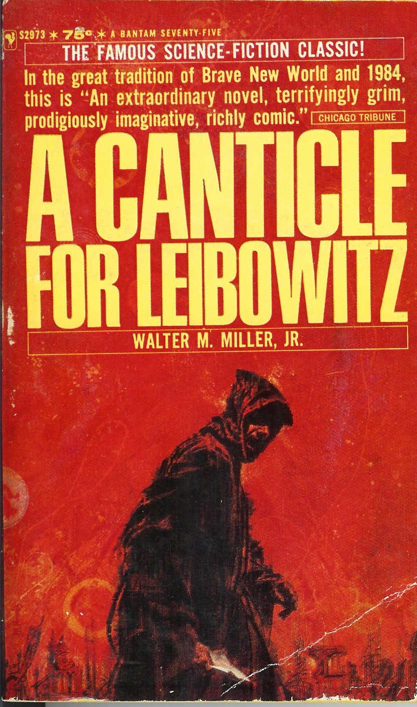
(Note: A Canticle for Liebowitz has had many, many covers. I am amused to note the first addition did such a poor job of communicating the book contents I would have assumed the novel was about a happy Trappist monk who made artisanal beer while waiting for the Von Trapp family to visit.)
So some things to note: First, the color schemes match. Now, I didn’t look up those books until after I’d created my fake cover, so there was zero planning there. Weird, right? Apparently the red and yellow theme is some kind of zeitgeist must have for this book. We’ll go with it.
But nevermind serendipity, just LOOK at the use of white space on those covers.
Seriously, look at that.
In both cases, fully half the book cover has no text intruding on it all. They let the artwork speak for itself. Both covers also allow parts of the text (the stuff that really isn’t that important) to be very, very small. Canticle went with the classic sci-fi sans serif, while The Handmaid’s Tale, marketing as literature rather than genre-fiction, used a more stately serif font with a lot of kerning. (The Handmaid’s Tale is clearly a serious book.) A Canticle for Leibowitz is a little more problematic because I really wouldn’t have thought that was a monk, but a sexy, mysterious assassin. Still, it’s an intriguing cover, done decades before that look became cliche for epic fantasy.
What else do these covers have in common? They used illustrations.
Now I’m biased. Being an illustrator, I like seeing illustrations used for book covers, but the hard truth is that illustrations are just about never free, which makes illustration (caveat: GOOD illustration) a bit like wearing an expensive designer label. I suspect a lot of readers think the book must be better because more money was clearly spent on the outside wrapping. We’re not going to use custom art or photography today though — this is all about stock stuff. Okay, so that said, I looked around some stock sites until I found a photograph I liked. It’s for global warming, but I think it feels a bit post-apocalyptic. And look! Yellow!

So, confession time: I then cracked open Photoshop and futzed with it a bit. Specifically, I distressed the buildings in the distance so they look ruined and I added a red flower in the foreground as a symbol of our main character’s defiance. I did NOT include the girl herself. I feel pretty safe on this call, since more and more YA books don’t include the face of their hero on the cover. Then I set up my type, using very standard fonts: Trajan, League Gothic and just a tiny smidgen of Alex Brush for accent (all fonts used are available free from http://www.fontsquirrel.com.) Here’s the result:
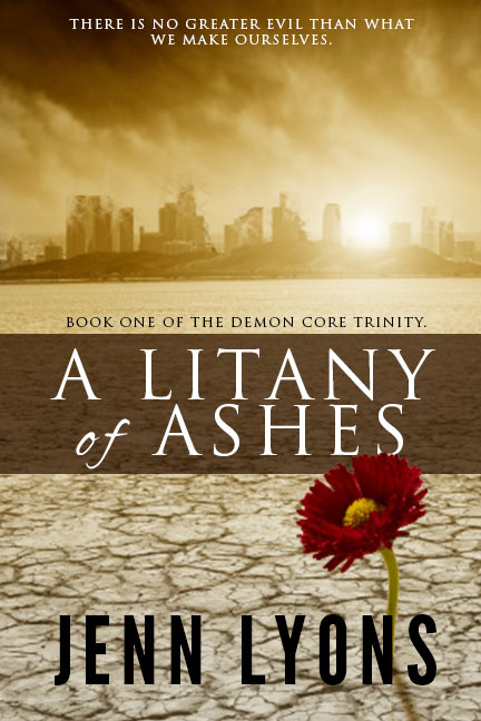
Bam! That’s what I’m talking about. Is it perfect? Oh hell no. But it looks a lot more professional, and the most important parts (that would be the title and the author name) look legible when the book is a thumbnail sized. If this were a real book, I’d create multiple concepts prototypes, playing with ways I can better communicate the importance of religion to the book and the Crucible-like hunting of witches (i.e. mutants contaminated by radiation.) The book imagery leans to the right at the moment: I’d move around the flower and play with different layouts. Then I’d show it to both artists who can give me professional-level feedback and friends who read YA books. Show them different versions, so they can contraste and compare what they like. Right away I already know this could be better, but I wouldn’t be ashamed to see this for sale with my name attached either.
And it’s much, much better than the first version, isn’t it?
For Part 1 in this series, see Book Covers: Typography, and Part 2, see Book Covers: Backgrounds.
