Latest Posts

Leaving Carcosa: Post-Mortem on True Detective

This is coming in a bit late for those who have already finished watching the first series of True Detective (I wrote this the night after the season finale, but real life interfered with the posting,) but I figure the show will have a long tail as people watch it later, so here we are.

So first, some background: I only started watching True Detective because I heard about the King in Yellow connection.

For those unaware, the King in Yellow is the name of a collection of short stories written by Robert Chambers, published in 1895. He borrowed the city of Carcosa from writer Ambrose Bierce, but otherwise introduced the idea of the mysterious titular entity, a occult ‘Yellow Sign’ and a play that would drive its viewers insane. Only four stories in the collection directly concern the King in Yellow, but that was enough. Chamber’s work was lovingly appropriated by H.P. Lovecraft and merged with the greater Lovecraft milieu, becoming part of a rich body of horror mythology, the King in Yellow accepted as one of the names of Hastur. The King in Yellow has inspired rock bands, RPGs and countless stories and novels.

So an HBO story centered around the King in Yellow was, in my opinion, a big deal. I was there.

I hated the two main characters, neither of which was particularly likable (that’s been a very popular theme of late in TV shows and movies, hasn’t it?) but with only eight episodes I figured there was no harm in sticking with the series and seeing how it played out. From a story point of view, it plays out well. Without giving anything away, I have to say that no guns remain on the mantle piece after the story’s conclusion and it doesn’t pull any punches or play any tricks. It’s ultimately a tale of two men demonstrating some damn good detective work, stronger together than they are apart in spite of their differences. Thus the name of the show.

What it is NOT, however, is an supernatural horror story.

So I thought this was fascinating in light of all the rampant reddit speculation and conjecture about what was really going on, the deal with Marty’s daughter and father-in-law, and generally speaking, all the attempts to turn this story into something much more supernatural than it now seems it was ever meant to be.

“But wait,” my husband protested, “what about the flight of birds who formed the yellow sign? Rust saw that, and he wasn’t hallucinating at the time.”

“How do you know he wasn’t hallucinating?”

“Because they use a specific visual language whenever he hallucinates. It’s glowy. Since the birds weren’t glowy, he really saw them do that.”

Hmm. Interesting point, particularly when the director has been so adamant about not lying to the audience. By my memory, the non-glowy versions of hallucinations happen only twice — the bird symbol and what Rust sees at the end. So perhaps Rust only assumed those two instances were hallucinations? Maybe so. Could there be a core of Lovecraft supernatural to the story after all, as our story villain claims in the last episode when he boasts how close he is to ‘ascension?’ It’s possible. There might be some magical realism hiding in this show’s self-described corrupted creole soul, but it’s so well hidden that the argument could go either way.

However, even if that’s the case, there’s a chasm here, formed from the audience’s expectation of supernatural horror and the production company’s creation of a well-spun detective tale (I’m not going to get into my problems with women in the show right now and instead will just stick with the crime vs. supernatural elements.) And so it occurred to me: this show is the equivalent of putting the wrong book cover on a book. I’m sure this wasn’t intentional. All the branding for the show and all the opening elements are suggestive of a noir crime thriller with a heavy southern vibe.

And yet…

…intentionally or not, bringing the King in Yellow into the story brought with it a sense of expectation. The King in Yellow has baggage, and that baggage says ‘weird shit will happen here’. Because True Detective broke new ground (don’t quote me, but I’m pretty sure if you want to find a story about the King of Yellow that doesn’t include supernatural elements you have to go all the way back to the original collection by Chambers) I suspect that many of its viewers weren’t really prepared to deal with a mundane (if exceptional) crime series. If I removed my own preconceived ideas about the inclusion of the supernatural, if I wasn’t picking this up thinking it was a Lovecraft story but in fact a crime drama a la Silence of the Lambs, how would I feel about it?

I loved it. I really loved it. It surprised me by ending on an extraordinarily beautiful, positive note that struck me as incredibly unusual for a show so ‘gritty’ and ‘realistic.’ The show reminded me of something that Flannery O’Conner might have written, lurid and gothic but with this core note of grace that strikes with hammer bell purity right at the end.

Oh, and by the end of the season, I loved the two main characters. Rust, the nihilist, finds grace and hope, and Marty, the narcissist, learns to put the happiness of someone else before his own. It was really lovely.

I have to mark it down a point or two because women were only ever victims, trophies or succubi, but it’s an exceptional bit of storytelling. I’m very curious to see what story next season brings.

Kumiho

Kumiho was a short story I wrote about 10 years back, and semi-autobiographical. I chanced upon it when looking through some old files and decided to share it.

_______________

Since my boyfriend lost his car last summer, I’ve been taking the bus a lot. You meet a weird lot riding the bus, especially in Los Angeles, where public transportation is the option of last resort. There are the people who hop on and immediately open up the cases of stolen watches, the homeless who haven’t bathed in weeks if not months and sometimes, the people like me who are just enduring the commute to work. These are generic descriptions, but there are some very specific characters I’ve encountered: one fellow who carries a white cane and pretends to be blinds so he can ride for free; an old sweet-looking grandmotherly woman who always wears the same tweed suit with lace gloves and is so terrified that there won’t be any room for her on the bus she always cuts in front of the line, even if she has to push others out of her way.  I remember less benign sorts too: the young man mumbling to himself, writing ‘kill’ over and over and over on the pad of paper in front of him; the crack-high gangbanger who tried to pick a fight with a bunch of scared high school kids and waved his gun around on the bus, announcing: “I’m a god-damned Blood, so you had better be showing me some respect!”

This isn’t about any of those people.

When I stepped onto the bus this afternoon (after being elbowed out of the way by the old woman with the lace gloves), there was another old woman already seated. I sat down next to her, as most of the places were taken, and for some reason I was less than enthusiastic about sitting down next to she-of-the-sharp-elbows. I had my book with me. It was pretty close to a perfect arrangement: I could sit there and read, the old woman would just sit, and we wouldn’t have to so much as look at each other.

She had other ideas; she wanted to talk. Her English was quite good, but she’d never lost the Japanese accent.

There’s a hospital near where I work, and that’s where she was coming from. Her husband was there. She was coming back from visiting him, and she was very excited because today was the first day in six days that he’d been able to eat solid food.

I told her congratulations. That’s great news. I tried to read another paragraph from my tale of the Black Company.

No good. She wasn’t finished.

She told me the doctors said he probably wouldn’t make it. He’d had a heart attack and he hadn’t called a doctor when she told him to, and so she’d been forced to call 911 herself. They’d been forced to operate.

I told her I was sorry for her, and in the completely callous manner of a seasoned bus veteran, tried to go back to reading my book.

She smiled at me. Her eyes had the faint beginnings of cataracts, but they held no hint of sadness. No, she told me. He would survive. He had eaten today. He’d said he wanted to go home. From now on, she would make sure he took care of himself.

A third time, I tried to politely agree, ignore her, and go back to reading.

The old woman touched my hand. I startled, because well, she’d touched me. There’s some things you just don’t do. There was no threat to the touch though, no danger. It was just…unnerving. She looked at me and said: “You have beautiful hands. They are perfect. My hands were never so perfect.”

I stared at her. “Thank you, I…”

“Pretty hands. You don’t do anything to make them like that, do you? They look lovely all on their own.

I’d never really thought about it. I’m an artist, a writer. My hands are my life. Does sun block 50 count?

I was starting to feel embarrassed, so I said: “I’m just younger. I bet your hands looked just like this when you were my age.” She had a petite sweetness about her, a prettiness that suggested she probably had been quite stunning when she was young.

“I was your age when I met him in Japan,” she told me. “He was an American soldier.”

“Oh.” I resisted the urge to ask if he had been with the occupational forces. My ex-husband’s father had served there, after World War II. He’d come back to war trophies: a Japanese army officer’s ceremonial katana, two gorgeous silk embroidered tapestries, and two very beautiful, if somewhat unconventional, paintings of Mount Fuji painted with acrylics on silk. Frank had always claimed he’d paid for them, and I had no reason to doubt that, but I still didn’t think it would be very tactful of me to bring them up. Besides, she looked old, but she didn’t look that old.

“He gave me a diamond,” she said, holding up her hand. She whispered that, which I thought was prudent. She wore a wedding/engagement ring combo on her wedding finger. If it was diamond, it needed to be cleaned something fierce. She wore a string of pearls around her neck and another ring on the middle finger of her left hand, but the emerald was too big, too clear a green, to be anything but glass. The jade ring on her right hand was probably real enough. It was cut to look like a fox’s head. Probably made in China.

“He told me he would come back in five years to marry me. Five years can be a long time.” She laughed at the memory.

I looked at her. “Yeah. It can.” A damn long time, I thought. I didn’t know any American girl who would have waited that long, not for a soldier from another country, not in an age where there was no internet or cell phones to keep in touch. I wondered: had he written a lot of letters?

“Five years later, he came back, just like he said he would,” she explained. “That was when he was finished twenty years in the Army, you see. He retired. He said he gave me three things: his word, his heart and his time. This way, he could give all of himself to me.”

I started to get a funny itching sensation at the back of my throat. “Wow. That’s so sweet. How—how long have you been married?”

“32 years.” She smiled. “I love him very much. He’s a very good man. A very honest man. When he took a job, later, he would always come home the same time so I would know where he was, so I would know he wasn’t fooling around. When I think of our love, I feel very young.”

20 years in the military, with another 32 tacked on to that, and assuming he was 18 when he began…her husband was at least 70 years old. I couldn’t really tell how old she was. But him? 70 years old and a major heart attack? The lump in my throat grew.

She told me more then. How she had teased him, because he hated Japanese food but married a Japanese woman. How she preferred sticky rice, but she made him Minute-Rice, because that’s what his mother used to make him. How scared she had been at the heart attack, because she couldn’t move her husband. He was big man who weighed 200lbs, and she looked like she might break 100 if she was wet and holding the housecat. How glad she would be to have him home again. There was no doubt, no uncertainty, in her voice. How could he possibly die if he was hungry, if he wanted to come home?

It would be different this time. She would make him take care of himself. He’d always been too busy before. Too busy taking care of her.

I realized then, why she was telling all of this to a stranger on the bus: because she had no children, no family in the United States. Who knows? Maybe she had no family in Japan, either. In any case, she had thought her husband wouldn’t survive, that he was dead. The doctors had told her he wouldn’t likely make it, but here he was, opening his eyes, talking to her, eating real food and saying he wanted to go home. She was so full of joy she was ready to explode.

She had make someone understand. Anyone. Me.

Her stop came up before mine, and as she stood, she turned and asked me my name. Normally, I don’t give that out, but in her case I did without thinking about it.

She smiled and clapped her hand over mine. “Sweet girl. I’m Kumiho.”

I stared after her in shock as she walked down the bus steps.

Kamiho, I told myself. It’s the accent. You misunderstood her. Kumiho? That’s all wrong. That’s not even Japanese. A kumiho is a Korean nine-tailed fox. It’s something out of myth and legend, not real, and certainly nothing a parent would ever name their child. She must have said Kamiho. That’s a perfectly normal name for a Japanese woman, isn’t it?

I didn’t really know.

The bus moved on, and I lost sight of her. I never saw her again, even though I took that route every day for another year. Maybe we just missed each other.

When I stepped off the bus, I took the long way home, thinking about fox women, honor, and American soldiers, and how damn little I understand about love.

SFWA blows up…again.

For the last year, pretty much coinciding with my determination to make this writing thing really happen, the Science Fiction & Fantasy Writers of America has been embroiled with multiple strings of ugly controversies involving sexism, racism and the unfortunate growing pains of a changing marketplace and industry. Full disclosure: currently, I can’t join SFWA. I am an outsider, and I’ve never been a member of the organization.

That does not mean, however, that I don’t look to the organization, and that I don’t expect them to represent my interests. I do. I find Writers Beware to be an invaluable resource, and I respect and admire the effort that SFWA has made to protect writers from exploitation. They do a whole lot for the community. I want them to succeed, flourish, and damn it, I want to be a proud members some day. But just like knowing that your uncle Joe is a great guy who didn’t flinch at co-signing your first car loan doesn’t mean you have to excuse the fact he still calls ethnicities by pejoratives, I’m under no obligation to excuse the absolute bullshit going on with some of the members (and to be fair, non-members) of SFWA right now.

The argument (for those paying attention) seems to be divided into two main sides, with each side trying to define what the argument is even about.  Listen to one camp and you’ll be told that this is about freedom of speech and censorship, that members of SFWA have a right to say what they want in the interests of democratic debate, even if a minority of members find what they say to be objectionable or ‘politically incorrect.’ Listen to the other camp and you’ll hear how it’s got nothing to do with censorship, but with discrimination, sexism, and an attempt to keep a growing group of SFWA members marginalized and silent because that’s how the good ol’ boys want it, since they don’t want to share their clubhouse. Just to add some spice to the stupidity, a former SFWA member threw some slut-shaming in there as well.

Now, I’m just going to throw it out there that neither side is probably one hundred percent correct (except about the slut-shaming part which wins the prize for wrong, wrong, wrong,) because that’s just not how real life works. I suspect that many of the authors who supported the anti-censorship petition that was making the rounds probably did so not out of malice but with a genuine concern for SFWA and the wisdom to understand that the mouth silenced today might be one’s own tomorrow. Without sarcasm, it’s a subtle thing to understand the difference between rejecting or vetoing something as unprofessional and jerk-worthy with the rallying cry ‘you’re censoring my free speech!’ On the other hand, some of those members do seem, judging by their own words, to be truly outstanding douchebags of the thirty-third degree, who think that women should be seen and not heard  (or read!) and minorities have no place in the community. They talk about how SFWA used to be, the evil minorities poisoning its core (although bless their hearts for calling me ‘Young’), and in an ironic display of how they might genuinely not understand the evolving face of technology’s march, they did this in a public forum where the public could (and did) notice.

Oops.

Naturally someone set up a tumblr site to mine for the good bits. Naturally people completely lost their shit over it, as people tend to do. Articles were written. And since this particularly organizational body is already fighting off a previous infection, it’s quite sensitive to new attacks. It won’t take as much exposure to cause a reaction as it did before, so each time something like this comes up, it’s going to trigger not only the current situation, but all the unresolved issues still lingering. Everything gets hacked up (a bit like this metaphor.) Oh, and one of the men in question is threatening to sue everyone under the sun who may be even peripherally involved with sharing his publicly uttered, unedited words. Because that always works out well.

Okay then. So I too am throwing my two cents in, even though I’m not a member and virtually no one has any any idea who I am (to those who do: love you!) But here it goes anyway. We writers are nothing if not open to sharing our thoughts. Even when we’re not asked. Maybe especially then.

First, and this is just a personal favor, but if you’re going to cite the US Constitution, please read it. Wait, I’ll quote it for you: “Congress shall make no law respecting an establishment of religion, or prohibiting the free exercise thereof; or abridging the freedom of speech, or of the press; or the right of the people peaceably to assemble, and to petition the Government for a redress of grievances.”

So last I checked, that has nothing to do with a private organization’s rules for its own publications, except inasmuch as the USA sometimes makes laws that says private groups shouldn’t discriminate either. SFWA is not a newspaper! (And in point of fact, newspapers DO edit their own work. I worked at one for years. Just because you send a letter to the editor doesn’t mean it sees print.) So if a private organization tells you that you can’t behave in a sexist or racist manner in their official newsletter? That’s not impinging on your constitutional rights. Sorry. (Not sorry.)

You are of course free to say what you want as nastily as you want elsewhere, but you also don’t get to bitch if that organization decides you don’t represent the kind of image they want to portray and kicks you out. Again, you have a constitutional right to say what you like. A company or organization is also under ZERO constitutional obligation to print it.

Second, this is a matter of perception and public relations, and sorry, but public perception IS important. Never mind that there are members of this club engaging in some horrible behaviors, if SWFA wants to continue to be taken seriously as a lobbying body and champion of writers’ rights (or better, be taken more seriously — they’ve lost a lot of clout of late,) their public-facing side matters. And in this age, that means understanding that the Internet is a life under glass and what members of SWFA say in SWFA’s official newsletter will be taken as representative of SWFA as a whole. SWFA has a right to protect their own image.

Again, I like SWFA. I think they’re turning into something good (just way too slowly) but Holy Sputtering Dinosaurs, Batman, what’s been going on with some SWFA members lately has felt like watching a football hazing, where apparently you have to endure it all without complaint or protest or you end up with something even worse than having your head shoved into the toilet. My only consolation is that it’s not the leadership of SWFA who seems to be behaving this way. I have nothing but respect for John Scalzi, and I’ve been equally impressed so far with Steven Gould. So good on them for that.

The new counter to any accusation of sexism or racism (or hell, I guess I have to add ageism now that it’s the ‘Young’ writers who are being accused of this behavior) is apparently to accuse us of being politically correct, rabidly feminist, and attempting to politicize SWFA for our own ends.

I think that last one has some merits, because I suppose you could call it that when a group of underrepresented people try to gain a voice within an organization. In this case ‘our ends’ is asking that maybe women and minorities aren’t so discriminated against and get a little more respect. And oh, I don’t know, maybe stop thinking you have a right to grope us or something.

So guilty, I guess?

Guess what though! Good news! We’re here. We’re here, you can’t stop us, and we’re damn well going to keep writing. So HAH.

Reviews: Books on Writing

Over the holidays and into the new year, I’ve been reading two books on the craft of writing itself: Dwight Swain’s Techniques for the Selling Writer and Stephen King’s On Writing.

Dwight Swain’s book is pretty old, a bit hard to find, and honestly I’d never heard of it before I started to wonder why YWriter (my program of choice of late for book writing) had some of the special features it does for action and reaction scenes and the like. I wasn’t quite sure what to think of Dwight Swain’s book at first: it’s pretty clearly meant for pulp writing and some of the advice seems better suited to short stories than novels. While Swain himself is quick to point out he is simply describing tools which may be used or discarded at will, some of his most fervent advocates take his advice nearly to the point of religious gospel. Despite this, it’s a terrifically meaty book, filled with some of the best advice I’ve ever seen on pacing and creating tension. One could do much worse than to read this book repeatedly, and take seriously the author’s admonition on the importance of figuring out what works for you in your individual workflow.

On Writing is mentioned by a whole lot of authors (I believe Chuck Wendig refers to his own first reading as ‘life changing.’) There’s some good advice in there, as well as some interesting stories about Stephen King’s own life, but I also found some advice I flat out disagreed with, no matter how much King presented it as undeniable, unarguable truth. He even goes so far as to undermine some of his own assertions, such as when he denounces plotting and then describes how the origins of Misery began with a 16-page handwritten summary. (I’m sorry, Mr. King, but that thing you just did? That’s called plotting.) Sure, the book deviated pretty significantly from that original seed, but I think you have to be open for the book to move you in a different direction. That doesn’t mean it didn’t start with a plan. Certainly King admits he had an ending in mind when he began — it was just an ending he didn’t use. Likewise, when he talks about writing faster than his doubt? Yeah, I’m right there with you, Mr. King. SO RIGHT THERE.

By comparison, Techniques for the Selling Writer is a product of its time and uh, well, let’s just say society has moved forward some since this book was first written. While King suggests switching genders in a tale with cliched gender roles as a valuable writing exercise and way to learn not to fall into stale traditional stereotypes, Swain points out that the most popular stories have a hero, a villain, and a heroine — and in case you were unclear on the problem with that, the heroine’s chief feature “is desirability.” Oy. His advice to only use female MCs when selling to ‘women’s fictions’ is only getting tossed straight in the trash. No thanks, Mr. Swain!

So what’s interesting about both books is what they agree on, and they agree vehemently on one main point: telling a good story trumps any amount of pretty prose, wonderful characterization, or general literary merit. Of course, neither of these authors are viewed as heralds of literary achievement (were, in Mr. Swain’s case, since he has since passed away) so one might argue that of course they would say that. But I suspect they’re on to something. They aren’t the only two people I’ve heard say this. Dean Wesley Smith and Kristine Rusch both talk about how it’s better to be a good storyteller than a good writer (obviously, we all want to be both.) The popularity of certain books on the markets suggests to me that this is truth: I’ve flipped through enough bestsellers where the prose was excretable to suspect the book’s appeal must lie in another direction. That advice seems pretty solid to me.

Final Verdict: Read On Writing to say you have. It’s an easy read and there’s some genuinely good advice in there. Then go buy Techniques of the Selling Writing and memorize the parts on writing technique (and ignore the parts that are seriously sexist, racist, or otherwise completely out-of-touch.) There’s valuable advice in both books — it’s a matter of sorting through for what will work best for your own needs and process.

Make Believe

The above link goes to a Ted talk a friend sent to me earlier. I had a very strong, visceral response to it, as did several other women who saw it. Let’s just say it’s a high-emotional impact piece, particularly if you’ve ever been powerless, introverted, or felt like you were a fraud. Go and watch it by all means, but one of the things that Amy Cuddy brings up is the idea that if you pretend at a thing, you can inadvertently believe your own lies — and that’s not a bad thing. Force yourself to smile, even if you’re feeling melancholy, and (lab studies indicate) your mood will improve. Pretend to be angry and become angry. The physical body and how we chose to use it can directly affect brain chemistry, which means the little choices we make in how we stand, sit, and present ourselves to others can directly affect how we actually feel about ourselves.

Is that not the scariest and most wonderful idea ever?

I’m not quite buying into the idea that body posture is the cure for chronic depression, but feeling empowered and in control are emotions that almost anyone would surely find useful. I do fully support the idea that we can drastically affect our own outlooks by what we pretend to be.

I’ll give you an example. When I was seventeen, I belonged to a regular group of table-top RPGers. I was the only girl in the group, and most of the men were much older (at least in college, if not out of college.) And one of the men decided it would be funny to nominate my character as team leader while I was off in the bathroom. Haha, let’s see the teenage girl be in charge! Hilarity!

Except the group stayed together for years, and a funny thing happened. In pretending to be a strong, assertive female who could and would order around a group of men, I became that woman. Well, my own non-superhero version, anyway. The point is, I trained myself. I pretended until I wasn’t pretending anymore. Men fought me, and called me a bitch for ordering them around, and I took it all without flinching. Turns out that was pretty good training for when men did that to me in real life. My brain doesn’t know the difference, you see, between pretending to do it and doing it for real, so the first time I ran into a problem like that in my professional life, what I felt was not panic, but ‘Hey, I got this.’

So this is how I’ve come to believe that make-believe and imagination might just be the powerful force that we human beings possess. Will it solve everything? No, but if you pretend to be successful and powerful and imaginative enough times, I really do think you will not only come to believe it, but it will become true.

Turns out, you really can fake it.

A toast for 2013

This was the year everything changed.

It started with a Cracked article. Yes, Cracked. Now, Cracked sometimes sneaks in life lessons with their weird history and nerd comedy, and at the beginning of 2013, David Wong of Cracked issued a challenge to his readers: make 2013 the year that you close (warning: Alec Baldwin says mean things in that clip.) No excuses, no bullshit, no tired old lines about how you couldn’t because (insert whatever excuse is your preferred reason for not getting it done here.) No trite promises quickly abandoned, no self-defeating battles with the mirror. 2013 wouldn’t be about what we are, but what we do. He left what up to the reader. Learn a language, a martial art, make a painting, write a book. Learn a tangible skill, create a tangible result, do something. CLOSE. Kick some items off the bucket list, figure out what makes life worth living and DO THAT THING.

Not too hard to guess that my vow for 2013 was to finish one of the three books that had floundered in limbo for years. Hell, #2 on that Cracked list might as well have been written with my name on it. I was determined. This would be the year I finished a book. I picked one of the three books I had in progress, Blood Chimera. This would be the year I quit wallowing in the excuses that I have spent the last twenty years inventing for myself, the reasons why it was acceptable to never finish, and thus never, technically, fail. This year would be different.

The awesome part? This year WAS different.

Hell. Yes.

I’ve written other articles about what allowed me to snap through my limitations and finish that first book in months rather than years. Once I’d made that breakthrough, I decided to go ahead and finish one of the other remaining books. And then finish the last one. And then I wrote Blood Sin, the sequel to Blood Chimera, because by the time November rolled around I realized the first three times weren’t a fluke. Yes, I can close.

I wrote four books in 2013. I wrote four books, found a publisher for two of those books (Hey there, World Weaver Press!) self-published one (Marduk’s Rebellion,) and am in the process of self-publishing the last (The Culling Fields.) All total, I wrote half-a-million words. Now, I know of authors who smile at that and say ‘aww, isn’t that adorable?’ (When I was at DragonCon, author Kevin J. Anderson revealed he’d written 120 books in the last 20 years, a feat of writing which required him to crank out a steady 6 books a year. SIX.) But hey, after doing nothing, and having every excuse for it, four books feels damn good.

Now I won’t lie: four books required sacrifices. I work full time. I did very little gaming in 2013 and virtually no role-playing (once both major hobbies of mine.) I canceled all my MMO subscriptions and when Elder Scrolls Online comes out next year it’s going to have to be truly something incredible to grab my attention away from writing. My husband would have been a very cranky person except that (thank god) he’s a writer too, so he understands (his first book will be out in 2014.) Writing became my preference, the thing I want to do first, what fills up my dance card before things like movies, RPGs and my many, many hobby projects. Writing is the default state now, not what happens when ‘inspiration strikes.’ I write (or edit) daily, whether I’m in the mood or not. Most of the time, I’m very much in the mood, fingers itching to break out my keyboard. Modern technology and dropbox means I can write very nearly anywhere.

I’ve also discovered that this accomplishment brings with it unexpected side effects. One novel might be a fluke, two novels a coincidence, three a good start, but past that point you run smack into the realization that if you can finish four books, you can do anything. Anything. 2014 will be the year that I finish still more books (those first books all need sequels) but it will also be the year that I cut sugar from my diet and make a concerted effort to exercise and take care of myself. I’m switching to a standing desk at home (and hopefully at work) because my sedentary lifestyle is starting to catch up with me, and I’m not really digging the result (or rather, my back isn’t.) All of which is my way of saying that 2013 was awesome.

And it’s my sincere hope that 2014 is even better. Everyone have a brilliant new year.

Book Covers: Project Example

Okay, so in part 3 of this series, we’re now going to take what we’ve learned and apply it a real life example. Okay, a fictional example. A fictional example of fiction I totally made up. Even though I do in fact have a book cover on my to-do list right now (for The Culling Fields, the book I finished as part of NaNoWriMo 2013) I’m going to do evil, naughty things to the first example of such, and I don’t like the idea of doing it for a book that will actually see publication. Potentially awkward. Thus, let’s go with something invented for that purpose.

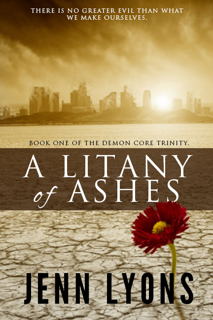
“A Litany of Ashes” is a post-apocalyptic YA about a teenage girl in a small community that survives by its religious rituals, designed to keep at bay the demons of radiation and nuclear fallout. But when she begins to think the demons are literal, is she going insane or has a terrifying new threat arisen in the post-nuclear landscape? So it’s a bit A Canticle for Leibowitz meets Handmaid’s Tale, basically. With demons. We’ll give it four type components: the title, the author name, a log line and a series mention.

  • Title: A Litany of Ashes
  • Author Name: Jenn Lyons
  • Log line: There is no evil greater than what we make ourselves.
  • Series mention: Book one of the Demon Core Trinity. (haha, Trinity — see what I did there? Ahem. I’m SO sorry. Okay, let’s continue.)

So with this knowledge in hand, I fire up google images and search for ‘nuclear holocaust.’ The first image I find is this: Operation_Upshot-Knothole_-_Badger_001

Now I strike it a bit lucky here: this is a public-domain image taken by the US government, so I can use it legally. It’s too small, but I’m so excited I barely notice! But what about the girl? I want a girl, right? Maybe I find a friend willing to let me take their picture. Maybe I actually go buy one. Here’s an image from Getty Images (note that this is just the preview image: I didn’t buy rights for this example.)

108317125

Okay, so let’s put this together? Ready? Ta-da!

BadBookCover

This hurt to create. Truly. Photoshop was so ashamed it crashed in the middle. And I probably didn’t use enough font variety to reach true authenticity, but we’ll go with what we have.

  • Bold italics all caps Times New Roman? Check.
  • Unreadable Blackletter in all caps? Check
  • Name small, unreadable, and tucked into a corner as though trying to disassociate itself with the book in the hopes no one will notice who wrote it? Check.
  • All fonts very very large, making it hard to read any of them? Check
  • Bad photoshop montage of photos that have no business being montaged? Check.
  • Lots and lots of filters on the type? Check.

In contrast, let’s name the two books that are inspirations for this one: A Canticle for Leibowitz and The Handmaid’s Tale.

handmaid 71OJ0Jb9lML._SL1408_

(Note: A Canticle for Liebowitz has had many, many covers. I am amused to note the first addition did such a poor job of communicating the book contents I would have assumed the novel was about a happy Trappist monk who made artisanal beer while waiting for the Von Trapp family to visit.)

So some things to note: First, the color schemes match. Now, I didn’t look up those books until after I’d created my fake cover, so there was zero planning there. Weird, right?  Apparently the red and yellow theme is some kind of zeitgeist must have for this book. We’ll go with it.

But nevermind serendipity, just LOOK at the use of white space on those covers.

Seriously, look at that.

In both cases, fully half the book cover has no text intruding on it all. They let the artwork speak for itself. Both covers also allow parts of the text (the stuff that really isn’t that important) to be very, very small. Canticle went with the classic sci-fi sans serif, while The Handmaid’s Tale, marketing as literature rather than genre-fiction, used a more stately serif font with a lot of kerning. (The Handmaid’s Tale is clearly a serious book.) A Canticle for Leibowitz is a little more problematic because I really wouldn’t have thought that was a monk, but a sexy, mysterious assassin. Still, it’s an intriguing cover, done decades before that look became cliche for epic fantasy.

What else do these covers have in common? They used illustrations.

Now I’m biased. Being an illustrator, I like seeing illustrations used for book covers, but the hard truth is that illustrations are just about never free, which makes illustration (caveat: GOOD illustration) a bit like wearing an expensive designer label. I suspect a lot of readers think the book must be better because more money was clearly spent on the outside wrapping. We’re not going to use custom art or photography today though — this is all about stock stuff. Okay, so that said, I looked around some stock sites until I found a photograph I liked. It’s for global warming, but I think it feels a bit post-apocalyptic. And look! Yellow!

108328890

So, confession time: I then cracked open Photoshop and futzed with it a bit. Specifically, I distressed the buildings in the distance so they look ruined and I added a red flower in the foreground as a symbol of our main character’s defiance. I did NOT include the girl herself. I feel pretty safe on this call, since more and more YA books don’t include the face of their hero on the cover. Then I set up my type, using very standard fonts: Trajan, League Gothic and just a tiny smidgen of Alex Brush for accent (all fonts used are available free from http://www.fontsquirrel.com.) Here’s the result:

A better version of the book

Bam! That’s what I’m talking about. Is it perfect? Oh hell no. But it looks a lot more professional, and the most important parts (that would be the title and the author name) look legible when the book is a thumbnail sized. If this were a real book, I’d create multiple concepts prototypes, playing with ways I can better communicate the importance of religion to the book and the Crucible-like hunting of witches (i.e. mutants contaminated by radiation.) The book imagery leans to the right at the moment: I’d move around the flower and play with different layouts. Then I’d show it to both artists who can give me professional-level feedback and friends who read YA books. Show them different versions, so they can contraste and compare what they like. Right away I already know this could be better, but I wouldn’t be ashamed to see this for sale with my name attached either.

And it’s much, much better than the first version, isn’t it?

For Part 1 in this series, see Book Covers: Typography, and Part 2, see Book Covers: Backgrounds.

Book Covers: Backgrounds

In part 1 of this series, I talked about typography. Let’s talk about backgrounds. Now I don’t know about you, but it’s not type that trips me up on book covers; it’s the backgrounds. There’s so much advice out here on this, and it’s often really contradictory. For example: genre-fiction often shows the hero and love interest on the front cover while this is apparently a huge faux pas in literary fiction. Some books barely have any background art at all, while on others, the artwork is the entire focus. If it makes you scream, you’re not alone.

So let’s address the elephant in the room first thing. Money. You remember that old saying about ‘you can get it good, fast, or cheap: pick two?’

Never has that saying been more true than right now for book covers.

Most self-published authors aren’t really looking to pay a lot of money for this stuff. Many of us just can’t. I don’t know about you, but I just don’t have the bucks to spend. And doing this ‘properly’–i.e. photoshoots and art directors and custom illustrations–often costs thousands of dollars. So we figure, okay, we’ll do it ourselves…how hard can it be?

Hard. OMG, this is hard. Stupid, crazy hard. Don’t let anyone try to tell you otherwise.

You are essentially going to have to learn a whole new skill, train yourself to a whole new level of aesthetic sensibility. And just like typography, there’s some common pitfalls that will trip you up like a mother if you don’t watch out for them.

So let’s point out that landmines, shall we?

3D art

Look, I get it. You’re not an illustrator and you have this program around called Poser that promises realistic life-like 3D art. This, you think, will solve all your problems. What’s not to love?

The problem is that much like being unable to create a professional quality illustration unless you are in fact a professional illustrator, 3D modeling is very tough work. I work with 3D artists a lot, and what they do? There’s no way I could hope to copy it, let alone get the lighting right so that the end result looks like something Pixar created. I very rarely see poser art on a cover that doesn’t look like exactly like poser art (hint: that was not a compliment). I respect the desire to do it yourself and get it right, but unfortunately, if that’s the case, you’re also going to have to put the work into making sure it looks professional — there’s a reason that you don’t see a lot of 3D art on book covers published by the big names.

While we’re on the subject of poser art, let’s talk about the Uncanny Valley. What is Uncanny Valley? It’s the idea that we as humans are very good at identifying faces — we are wired to do it, and we do it well — and things that are almost human trip our creep radar hard. We are more inclined to like something and respond well to it if it’s not at all human (teddy bears, caricatures, cartoons) than if it’s just a teeny bit off from it (realistic 3D art). So using a poser figure runs a risk of actively hurting your chances. Now, it can be done — there IS good poser art out there.

Just be very careful of this. Very careful.

Montage

So your book features a man, a woman, a lot of guns and a tropical location, so you look for a photo with all those things, but nothing works. Nothing’s quite right. You just can’t find a photo of a man, a woman, a lot of guns and a tropical location. For some reason photographers haven’t shot a gazillion of these images. The temptation seems to be at that point to cut-and-paste those elements together, to take a girl from that picture or a boy from that picture and try to put guns in their hands and put all of that on an island. It’s especially bad with romance novels, where you might want to picture couples in sexy states of undress.

Stop that. Stop that right now. Put the lasso tool away. Montages can work, but there’s a lot of skill involved and it’s not beginner level stuff. Even if you’re good at it, montages can’t make a new seamless photograph that looks like all those people were shot together in the first place. Your photo will NEVER look like everyone was natively in that scene, because the light on each person will be different, and the guns won’t be at the right perspective, and unless you’re very good with Photoshop, you probably left a little single pixel-write outline around each figure that exists as a signed confession of the fact that you cut-and-pasted those bastards together.

Basically, if you can’t make your montage look as good as something on a Hollywood movie poster, great. If you can’t? Don’t use this technique. Ever.

Using Celebrity Photos

I respect that your main character looks like Matt Bomer (gosh, so insanely pretty), but the ugly truth is that you can’t use a photograph of him to promote your book or grace its cover without all kinds of money changing hands, not even if it’s really how you’ve always envisioned the main character.

So don’t do this.

You will probably get away with it, but heavens, what if one of your books takes off and you find you’ve written the next New York Times bestseller? Because then you’ll be getting letters from Matt Bomer’s lawyers, which is no fun.

Stretching Photos

If you are planning creating an ebook and a print-on-demand copy of that book, you’re going to need a book cover that is pretty big. That POD needs 300 dpi, which means a 6×9 trade paperback is going to require art that’s 1800×2700 pixels just for the front cover (and even larger if the image is to wrap around). As you may guess, most of the images you find on google search won’t be that large, or they won’t be the right size. You’ll be tempted to stretch a photo to fit.

Don’t do this: it looks awful. It looks like exactly what it is, a photo stretched all out of its proper ratio, and fuzzy from being enlarged too much. It pretty much never looks right.

Drawing the Illustration Yourself

I’m quite obviously fond of this method, but there’s a catch: it needs to be good enough to pass as professional. I mean really professional. You have to be brutally honest with yourself about this. Go over to www.lousybookcovers.com and browse a while. Remind yourself that if the art you have doesn’t look significantly better than what makes it on to this site, you need to figure out something else. Also remember that any illustrations you use also need to be done in a large enough size to fit your novel. Pixilation is no one’s friend.

Solutions

So what’s to be done about this? Is there an easy solution?

No.

Sorry. I really am, but anyone who tells you this shit is simple is a lying liar who lies. The good news? There are solutions. Let’s look at a few.

  1. Create the background art yourself (totally possible) and learn the skills to create the cover using that art. Requires a heavy investment in time, but not much investment in money. More bad news: it’s damnably difficult to judge your own work.
    1. Corollary: You may know someone who can do this for you for free. Just be aware that if you have family or close friends who have the skills and are willing to use them on your behalf, you need to be the perfect customer. Being nit-picky and particular (“I’m not sure what I want, but I’ll know it when I see it”) is behavior that’s only acceptable from a client when they’re paying with cashy money.
  2. Pay someone for background art, whether that be buying stock art from a site or an illustrator on Deviantart. That’s going to cost anywhere from $20 upwards to $500 dollars, but it may be money very well spent if you find that perfect illustration and convince the artist to let you license it. Down side: Stock art is cheap because it’s not exclusive. So that perfect photograph you love so much may well end up on someone else’s book cover too.
  3. Pay someone to do it for you. A professional graphic artist is going to have skills, programs, and art resources that you probably don’t, and there’s a booming market specializing in book covers. For the same price you might spend on the stock art by itself, you may be able to hire someone to create the entire cover for you. There’s some fantastic and shockingly cheap services out there (some of the covers that show up on Wattpad these days are every bit as good as anything professionally done.) Just remember to look at their work and insist on a better quality than you can do yourself. Otherwise…why aren’t you doing it yourself?

Next time, I’m going to create a bad (really, really bad) book cover as an example, and see what can be done to make-over the cover into something a bit more professional.

Book Covers: Typography

Okay, so let’s talk a little bit more about book covers. Specifically, let’s talk about typography (we’ll cover background art on a different post.)

Now, if you’re not a graphic designer, you may think that you don’t need to know anything about typography. Even if you’re an writer, you may not think you need to know it, either because you’re hiring another person to do the work for you or because a publisher has someone in their employ who will design the book cover for you.

Please allow me to reassure you: you do need to know this stuff. Why? Because there’s some awful work being done out there, and some of it is being presented to authors who don’t know any better as ‘professional’ when it looks anything but. Some of this work is being done by publishers, so its a trap someone can fall into even if they don’t consider themselves to be an independent or hybrid author. Make no mistake: this is your brand, your marketing identity, your logo. It’s in your own best interest to make sure that it looks as good as it can within your means.

So let’s talk about type. First, there are a lot of type faces out there. Thousands and thousands of type faces of mind-numbing variety, which can be both intimidating and extremely frustrating if you’re searching for that one perfect style (or trying to remember where you saw that perfect font.) They also come with a variety of legal restrictions which can be a bit daunting (some fonts are only free for personal use, for example, and so can’t be legally used for a book that’s sold for profit, while others aren’t available for ebooks.) It’s important to check the limitations of a given font’s license.

This is probably why so many people just use the fonts that come stock on their computer, not realizing that these are indeed the fonts that everyone has stock on their computers. If people do brave the wild internet to find fonts, they discover that there’s some terrific stuff out there, and some stuff that could be used on maybe one project ever, and some stuff that had no business ever being used on the cover a book, ever, under any circumstances. Personally, I advise people to make peace with the fact that your favorite font is probably not going to be what looks best on a book cover, and that if you’re going to do it yourself, you’ll have to experiment a lot before you find the right fit. It’s a pain, but if good typography was easy…well, you know the rest.

First thing you will need a good font manager. If you don’t already have one, NexusFont is highly recommended for the PC (and free.) This will sidestep the tedious loading and unloading of fonts, which is a good thing, because you’re going to do it a lot.

So let’s go over the rules for book cover typography.

  • First:  it MUST be legible.
  • Second: No really, make it readable or GTFO.
  • Third: Have I impressed upon you how important legibility is yet? SO IMPORTANT.
  • Four: Make it look good.

I tend to see the same mistakes being made in that regard, and they really aren’t that hard to avoid.

Ruritania

  1. Using novelty or calligraphy fonts. Bwhaat? But you have a fantasy book and you are absolutely in love with Ruritania which will be perfect on your cover…and… No. No it won’t. Tell yourself no. I understand it’s tough, but this is a tough industry. Be strong. Ruritania is a beautiful font. It’s also way too damn busy to be on a book cover, which is true of just about any calligraphy font or font with ‘chancery’ in the title. Go look at the fantasy books in your local bookstore. Go look at Game of Thrones. Notice how the font is just a normal serif save for a few little flourishes to personalize it? Remind yourself that before using Ruritania, Black Chancery or any font like it. If George R. R. Martin doesn’t need all the frills, neither do you.
  2. Forgetting that fonts are associated with genres. This isn’t a hard rule, but generally speaking, a serif font is probably going to show up on a fantasy or steampunk novel, a san-serif font on science-fiction (and often urban fantasy,) and script fonts on romances. Quirky fonts on young adult. Typewriter-style fonts are either on noir novels or sometimes horror stories. I don’t want to make too many generalizations, because there are plenty of exceptions, but it’s a good idea to understand that your font choice can have a large impact on what genre buyers think your book belongs.
  3. Putting bevel or embossed edges on type. For some reason I see this, again, on fantasy covers. Maybe people think it will make the font look like stone? But no, no it doesn’t. It doesn’t make it look professional either. It just makes the writing hard to read and reminds the reader that Photoshop exists. badtypeexample
  4. Using ANY photoshop filters. I’m not saying you can’t use them (heck, I use a drop shadow for the headline of Marduk’s Rebellion to make it pop a little more from the background, and I make no apologies for that) but be careful, because there be dragons. Again, look at what the big guys are putting out and realize that almost no one puts a lot of extraneous fluff on their type (except perhaps Baen, and while I understand the brand they’ve created, I don’t recommend you copy it.) Keep it simple, clean, and easy to read.
  5. Making the font the same contrast as the background. I would assume this would be obvious, but it isn’t…I see this all the time! Someone has a dark blue background on their cover and uses a similarly dark blue text on top it (maybe with a white glow behind it), or uses white text with a black drop shadow on a white background. I recently saw a cover where the author had created a brown stone texture for the book and then used a brown stone bevel for the book name. It was all but invisible when reduced to a thumbnail.
  6. Stretching type to fit the space. Okay, so just because you can adjust the horizontal and vertical size of a font does not mean you should. (Pro tip: you shouldn’t.) Fonts are designed to look best at a particular proportion and if you stretch a font to 150% height and 75% width it’s going to look stretched, awkward, and amateurish. You want the font to be larger? Make it larger by increasing the point size. You want it to be narrower or shorter? Find a different font. Yes, really, find a different font. No matter how much you love that font, if it’s not a narrow font and you need it to fit in a narrow space, it’s the wrong font. With how many free fonts are available these days, there is guaranteed to be something out there that fits your needs (no pun intended.) Oh and for goodness sake, no twisting, distorting or bending unless you actually DO want your cover to look like a circus poster. By the same token…
  7. Making fonts ‘bold’ or ‘italic.’ This takes a little explaining, so bear with me. There are two ways to make a font bold or italic in most programs. One is to hit the ‘bold’ or ‘italic’ icons on the top of the page, and the other is to actually go and select the bold or italic version of the font. In most programs, you’ll get two different results: the first way just takes the normal font and shoves it all into a slant or adds an outline around for boldness; the second method actually selects a specially designed version of the font that typically looks more polished and refined. If you make a font italic or bold using the first method, it typically looks quite bad. On that note, if you make something italic, please don’t have it be in all caps, especially if it’s your name or the book name. Leave the italics for accent text, if you must use it at all.
  8. Use more than 3 fonts. Honestly, more than 2 is probably too much, but sometimes it’s necessary. Point is, you want your cover to have a reasonably consistent look, and the fewer fonts you use, the easier that is to achieve. If your name is in one font, your title is in two different fonts, your subhead in a fourth font and you have a log-line in yet a fifth font? I guarantee you it’s too much.
  9. Use tired, dated fonts. There are certain fonts that many people consider cliche or dated. You might get away with some of these if you’re deliberately looking for a retro 80s feel, but its safer to avoid: Comic Sans, Times New Roman, Papyrus, Helvetica, Zaph Chancery, Zephyr, Bauhaus. One piece advice I’ve heard which is pretty solid is simply don’t use a font that came stock on your computer.
  10. Use a font created for an existing brand. Lots of times designers will actually create a custom font for a book, movie, TV series, and if that book becomes popular, some enthusiast will expand that into a whole, complete typeface on a lark. The problem with this is that the Harry Potter font is pretty much instantly recognizable as the Harry Potter font. Same goes for A Series of Unfortunate Events, Star Wars, Star Trek, Beautiful Creatures, etc. You want your own look, not someone else’s.

Okay, so that’s a lot of ‘don’t do this.’ What about do’s? What about fonts that will, generally speaking, work?

Over at the Book Designer they recommend Trajan, League Gothic, ChunkFive, Franchise and Baskerville, and honestly, I’ve got no gripes with that. Those are all solid, fine choices for fonts (and all available for free from fontsquirrel.com) So let’s expand out a little…I’m not going to recommend anything that isn’t free, and isn’t available for commercial use. Because nothing sucks more than falling in love with a font you can’t use or afford.

  1. Prime. This is a good font with a high-tech sci-fi feel that will pretty much instantly communicate that your book is science-like things.
  2. Alex Brush. Used correctly, this is a fantastic font for a romance cover. Used incorrectly, it will make me weep. (Hint: use it for a short title, and don’t use it for your name.) Allura and Aquafina are also solid choice for script fonts used to good effect as accents.
  3. Calluna. Related to Museo Slab (which is itself a very nice font) Calluna works very well for Fantasy books or any book where a good Serif font would be ideal.
  4. Droid. I used this font for Marduk’s Rebellion. It’s not for everything, but it has a clean, condensed, modern look that fit the project very well.
  5. GriffosFont. This feels a bit Victorian to me, just a touch old-fashioned, so it would be terrific for fantasy or steampunk novels.
  6. Heavyweight. Just a tiny bit grungy, but not so bad that it hampers readability. Solid font for Urban fantasy.
  7. Nexa. A very nice sans-serif. Not all of the fonts are free, but Bold and Light are, which is enough to make yourself something pretty.
  8. Quatrocentro. A nice alternative to Trajan

There’s plenty more out there, and pretty much no good way to find them except to fire up your search engine and go looking. Because I don’t do graphic design for a living anymore I usually have to spend a few days exploring fonts to find the right one. I think it’s worth doing.

Okay, next time, we’ll talk about background images, and why they are so extremely tricky.

Dracula, or When Villains are Dumb

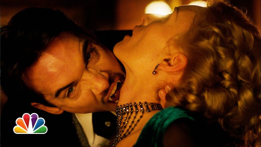
So I don’t normally post reviews here, but I’ve been watching the show Dracula recently, and I’ve got some comments I just have to get off my chest. It’s about villains, and I’ll use Dracula as an opportunity to discuss them. (There will be spoilers below.)

So if I had to give the elevator pitch for the TV series, it would be:

It’s the Count of Monte Cristo, but the Count is Dracula, not Edmund Dantes. Also: steampunk.

It’s not a perfect show, but it’s entertaining and Johnathan Rhys Myers sure is pretty, isn’t he? Like the Count of Monte Cristo, the main story revolves around a mysterious stranger who arrives in town with a lot of money, some exotic servants, and a plan to get his revenge on the people who wronged him and his. The people who wronged him are in this case a big illuminati-like organization called the Order of Dracul (which if you’re paying attention to actual history, is the real-life ‘let’s kill all the Turks’ group to which Vlad Tepes’ father belonged.)

But in the TV show? Seriously, these guys are too stupid to be allowed to live. In fact, it’s almost a shock they’ve survived to the Victorian era. (They are still trying to kill all the Turks though, but now it’s because they want to control the Ottoman Empire and all its oil.)

By the third episode, we’ve learned that while the Order burns Dracula’s wife at the stake, they are the ones who turn Dracula into a vampire. As punishment. Because…

Really, I don’t know why. There’s zero good explanation for this. It’s colossally stupid. This is one of the classic blunders, right up there with invading Russia in winter or killing a boy’s parents in front of him while they’re leaving the movies. Vlad Tepes was a mortal man (if historically bad-ass) with all the normal mortal vulnerabilities. He could be killed by any old sword, he could die of disease, he would, given enough time, just grow old. So what does the Order do? They punish him by removing all those vulnerabilities, giving him superpowers, making him immortal, and giving him a single weakness: sunlight. It would like turning a man into Superman JUST so he could be tortured with kryptonite. Good job, dumbasses, you would have had just as much luck using sharp knives, starvation and a rack. Except then your victim probably wouldn’t escape.

Which Dracula does, of course. He escapes immediately and with such effortless ease I have to wonder if the members of the Order who came up with this punishment were actively trying to destroy their cabal from within.

Do they learn from their mistake? No! They do it again! Okay, to be fair, they don’t turn Abraham Van Helsing into a vampire for disobeying them, but they do burn his whole family alive and make him watch. This is basically the equivalent of sending the man a valentine’s day card that says, ‘Won’t you be my nemesis?’ Yeah, they probably planned to kill him next, but that clearly didn’t work out, which leads to Van Helsing resurrecting their greatest enemy, Dracula, which is only possible because of the Order’s poor life choices.

Then there’s the Order’s treatment of its own members. At one point, Dracula deduces that one of the group is gay, and uses the fact to blackmail him into selling Dracula controlling interest in a company Dracula desires. Because the member had been explicitly forbidden to do exactly that, he’s put to the death by Order for ‘putting his own interests above the Order.” As a result of this, his lover (also a member of the Order) commits suicide. So good job: two Order members dead AND a major corporation, just from one teeny piece of blackmail. So I have to ask: what kind of secret society doesn’t know the shit on its own members? This particular member being gay wasn’t really much of a secret. It was SO not a secret that a hack reporter (Harker) working at the local newspaper knew about it off the top of his head, no investigation required. While everyone was going to the mattresses to protect themselves from this upstart American entrepreneur (whom everyone knew was going after the company in question,) did no one stop to think about exploitable skeletons in the closet? Hey, Steve, do us all a favor and stop hanging out at the gay cabaret bars for a few months, okay?

In contrast to this is Dracula himself, who absolutely is a villain (in very much the same vein as the Count of Monte Christ or V, but with slightly more murder) and who it seems has read the entire Rules for the Overlord list and memorized it. Adversarial relationship with Jonathan Harker because Dracula has designs on Mina? No! Instead, Dracula hires Harker and pays him obscene amounts of money to dig up dirt on his enemies. Dracula goes so far as to buy Harker a house. Crazed, insane man-servant who thinks bugs are the ticket to immortality? Nope. Renfield is competent, perceptive, and utterly unafraid to call Dracula on his bullshit (Renfield is quite honestly the trusted lieutenant that every good supervillain wishes they had.) Creepy psuedo-rape of Mina? Why do that when he can be endlessly supportive of her ambitions to be a doctor and make it clear he values her as a person and not just as an object. He even has enough self-control to seduce, rather than kill, the Order’s premier vampire hunter, seeing the wisdom in keeping one’s friend’s close and enemies closer (way, way closer — although how does one have regular hot sex with a vampire without noticing they don’t have a heartbeat anyway?)

In short, he absolutely behaves like someone who’s had 400 years to figure out how this whole evil mastermind thing is done.

I’ll be curious to see what screws it up for him. I suspect it will be Van Helsing, whom Dracula doesn’t quite trust (a mutual feeling) and who is obviously stringing Dracula along on this whole ‘serum to tolerate sunlight’ deal. Mina probably won’t help either, given her snooping into her teacher’s (the same Van Helsing) private interests. There’s also himself: Dracula has quite a temper, and he occasionally behaves rashly. If they continue with the Count of Monte Cristo theme, I expect his own conscience to be his worst enemy, as his relationship and feelings for Mercedes (sorry: Mina) begin to interfere with his quest for revenge.

But that’s okay, because honestly his actual enemies need to step up their game. If Dracula self-destructs, that just puts them on even footing.